

Data speaks 10 times louder than opinions. I heard this award winning author economist speak in a new way about real estate investing. His completely numbers driven approach to investing went against everything I had learned. It piqued my curiosity and caused me to look more deeply into his proven strategy.
Reproduced with permission from Robert Campbell, author of Timing the Real Estate Market.
Housing Prices Are Still Rising – But at a Rate-of-Climb that Continues to Slow
U.S. home prices rose in April, but the rate of annual gains has continued to fall from previous months. This is shown by the chart to the right, which shows the year-over-year returns from three major home price providers – the National Association of Realtors (N.A.R.), Case-Shiller, and the Federal Housing Finance Administration (FHFA).
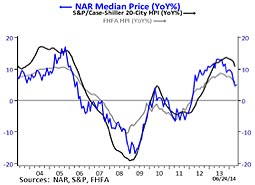 While the annual numbers continue to worsen, the month-to-month valuations are still rising in all three home price indexes. This steady downtrend in market momentum suggests that this years’ high demand spring-to-summer selling season (that started in April) may turn out to be decidedly underwhelming, even though home prices should continue to rise in the summer months.
The Case-Shiller 20-City Index – which is represented by the darkest (and smoothest looking) line on the chart – rose 10.8% in April compared with 12 months earlier and continues to show the highest year-over-year gains of any of the home price indexes. With an annual gain of 12.4% in March 2014, the 20-City Index fell to its lowest year-over-year gain in 13 months.
As you have been alerted to in previous Timing Letters, the weakness in existing home sales that began in mid-2013 was likely signaling a slowdown in price appreciation. And this key leading indicator for the housing market was accurate once again: the year-over-year gains we saw in April were the slowest annual rates of appreciation in the last 1-2 years.
Let’s now look at the price movement in the cities that compose the Case-Shiller 20-City Index, which uses repeat sales of existing single-family homes in each of the 20 U.S. metro areas to track prices.
The 20 Case-Shiller Cities
While all the 20 Case-Shiller cities continued to register year-over-year gains, 19 out of 20 posted annual increases that were lower in April as compared to May. The three cities in California saw their 12-month returns worsen the most: San Diego (-3.6%), Los Angeles (-2.9%), and San Francisco (-2.7%). After making gains of over 20% for 13 straight months, San Francisco saw its rate fall to 18.2%.
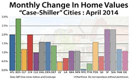 On a month-to-month basis, the Case-Shiller 20-City Index increased 1.1% in April. As shown on the chart below, the monthly price gains were seasonally strong across the board – with all 20 cities posting positive returns in April. Only seven cities had lower monthly gains in April than in March – which included San Diego, Los Angeles, and San Francisco.
Boston was the city whose housing prices rose the most in April – and it was also the only city to show a higher year-over-year increase in the last 12 months.
The California Housing Market
As reported by DataQuick Information Services, I now want to look at the most current housing data (May 2014) for California. Please know that DataQuick uses the “median price” for tracking home values – which means it is the midway price of all houses sold during a given time period, with 50% of all homes selling above it and 50% selling below it. Case-Shiller, on the other hand, uses “repeat sales” to measure price changes.
The median price paid for a home in California was $386,000 in May – up 0.8% from April and up 13.5% since May 2013.
The May 2014 median price for California was the highest since December 2007, when it was $402,000. On a year-over-year basis, the median price has increased for the last 26 months, with gains as high as 33.5% in July 2013 – which not unexpectedly, is near the time when year-over-year sales volume (which is a pure measure of demand for housing) also started falling. Home sales in California are down roughly 14% in the last 12 months.
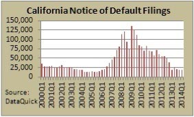 Although the chart to the left shows that Notice of Defaults (NODs) for California are hovering near 8-year lows, NOD’s were up 3.5% over the last 12 months ending Q1 2014 – which was the first quarter in the last 4.5 years to log a year-over-year increase in CA default filings!
With two key leading housing indicators – sales volume and NODs – now flashing clear warning signs, the uptrend in California housing prices may be in its final innings and nearing its end.
With respect to months of unsold inventory in California, there were 3.6 months of supply in May 2014 – which was based on the pace of CA’s May’s sales volume. While anything less than 6 months means that CA sellers, and not CA buyers, have the best negotiating power – the 3.6 months of supply in May was 38% higher than it was in May 2013. So while housing inventory may still be low in California, the supply of unsold homes on the market clearly increased in the 12 months that ended in May 2014.
Let’s now move from the California housing market to the U.S. housing market – and find out what some of the key leading indicators are saying about the health of the national real estate recovery.
The State of the U.S. Housing Market
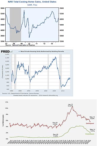
As shown on the chart to the right, existing home sales rose 4.9% in May, which represented the highest month-over-month gain since August 2011 (5.5%). Despite the strong increase in May, sales remain 4.9% lower on a year-over-year basis and 9.1% below the peak reached in July 2013.
 On a regional basis, May sales were strongest in Midwest where they rose 8.7% (-7.7% YoY) and weakest in the West, where they increased by 0.9% (-1.4% YoY).
There was a monthly increase of 5.7% in the South (-0.5% YoY) and 3.3% in the Northeast (-3.1% YoY).
The National Association of Realtors said there were 2.28 million existing homes for sale in May, a 5.6 month supply at the current sales pace. That compares to a 5.0 month supply of homes for sale in May 2013.
New home building permits is another key housing indicator that I closely watch – and that’s why it too is one of my five Vital Sign indicators.
As shown on the chart to the left, after a steep upward climb that started in 2001, the number of building permits have clearly leveled off in the past 12 months.
There were 1,005,000 permits pulled in May 2014 – down slightly from the 1,010,000 permits pulled in May 2013.
Because building permits are often subject to big monthly revisions, I wouldn’t label building permits for the U.S. housing market as being in a year-over-year down trend that is unfriendly to price appreciation – but the clear upward pointing trend that existed from 2011 to 2013 is currently a thing of the past.
Foreclosure sales and mortgage defaults (which is the first step in the foreclosure process) are more key indicators whose trends help to forecast the direction of housing prices.
The chart to the right – courtesy of Black Knight Financial Services (BKFS) – shows the percent of all U.S. mortgages delinquent and in the foreclosure process.
5.62% of all U.S. mortgages were delinquent in May 2014. This was their lowest level since 2007 – and down roughly 12% from May 2013.
BKFS reported that 1.91% of all mortgages were in the foreclosure process. This was their lowest level since 2008 – and down 32% from year ago levels.
While the loan delinquencies and foreclosure starts are almost back to normal levels, the trends are still down – and downward moving trends in these two key indicators are friendly to future price appreciation.
What Happens When the Fed Ends QE3?
As expected, the Fed announced in June that it will cut its monthly purchases of Treasury bonds and mortgage-backed securities to $35 billion from $45 billion. Scheduled to take effect in July 2014, this $10 billion taper marks the fifth round of reductions to its most current policy of Quantitative Easing (QE), a program known as QE3.
The Fed first announced QE3 in September 2012 – and said it would buy $85 billion of Treasury bonds and mortgage-backed securities each month. In December 2013, however, the Fed reported that it would make a $10 billion monthly cut to the program. If the Fed continues their tapering process at $10 billion per meeting, QE3 be completely phased out by this fall.
As I have explained in previous Timing Letters, QE3 was designed to lower long-term mortgage and interest rates – and in turn stimulate the real estate market and the U.S. economy.
So what could the end of QE3 mean to the U.S. housing market and its economy?
Back in 2011, the Bank of England (the U.K.’s central bank) published a paper titled “The United Kingdom’s quantitative easing policy: design, operation, and impact.” As shown in the chart below, the paper theorized what would likely happen to the macro-economy during QE – which is shown to the left of the dotted line – AND after QE ended, which is shown to the right of the dotted line.
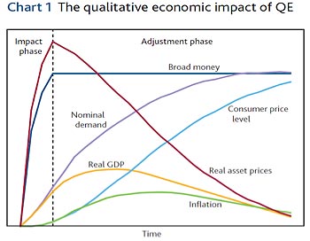 As per the paper by the Bank of England (BoE), the overall effect of asset purchases (i.e. long-term bonds) on the macro-economy can be broken down into two stages: the impact phase and an adjustment phase.
During the impact phase – which is where we are today – the two most dramatic things we see on the above chart are as follows: (1) a huge increase in the monetary base (broad money) from the trillions of dollars of printed money that have been injected into the system by the central bank; and (2) the simultaneous upsurge in asset prices (e.g. stocks, real estate, and bonds) that have been bid up by all the money that has been injected into the system and lower borrowing costs.
During the adjustment phase – which is where we would be if the Fed ends QE3 in the fall of 2014 – shows a completely different story according to the BoE report. This phase would lead to collapse in asset prices. Why? Because the sugar high that resulted from Fed manipulation (a highly artificial one-way market in interest rate repression) will be followed by a ferocious hangover.
In the adjustment phase, long-term interest rates would begin to rise because the Fed would no longer be keeping them low through their massive bond purchases. According to the BoE report, higher interest rates would be met with increasing organic demand from savors who are seeking higher returns on their money.
This rising demand in the marketplace would continue until rates are restored to a higher free-market equilibrium level that is un-manipulated by the Fed – which, as the right side of the dotted line shows, would be basically good for the economy but bad for asset prices.
Where could interest rates go when QE3 ends?
If QE3 is removed by the end of this year, yields on the 10-year Treasury Note could revert back to the levels that existed prior to November 2008, which marked the start of QE1. As shown on the chart below, this means rates on the 10-year T-Note would rise from 2.6% to roughly 4.5%.
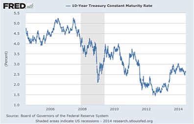
Because mortgage payments increase by 10.75% for every one-percent rise in mortgage rates, on a pure interest rate play (all else being equal), this means housing prices could fall by roughly 20% if mortgage rates were to rise by two percentage points.
As I have shown you, the upward momentum in rising home prices is clearly starting to wane. Because markets tend to discount future events, this makes me think that my friend and astute market watcher Richard Russell of Dow Theory Letters could be right when he recently asked: “Is the real estate market beginning to discount trouble at the time when the Fed finally terminates QE?”
It’s true – and it’s possible the real estate market may be sensing it – that things are easier to get into than out of.
Current Housing Trends for 17 Major U.S. Cities
The table below shows data through April 2014. Here’s how to read the table and determine what it is telling you. If housing prices are likely to rise in any of the 17 cities, the Market Momentum (MM) reading for April 2014 will be a positive number – and if prices are likely to fall, the April 2014 MM reading will be a negative number. This tells you whether the primary trend of the market is up or down – and whether you should be invested in the market for potential price appreciation, or if you should be out of the market to protect your capital from loss. (Note that changes in home prices are calculated from Case-Shiller Home Price Indexes.)
It is also valuable to know whether a housing market is getting stronger or weaker relative to the primary trend. This can be determined by comparing the latest Market Momentum reading (April 2014) to the MM reading from four months ago (January 2014). If the reading has become more positive compared to four months ago, it tells you the market is getting better relative to the primary trend. If it has become more negative
compared to four months ago, it tells you the market is getting worse.
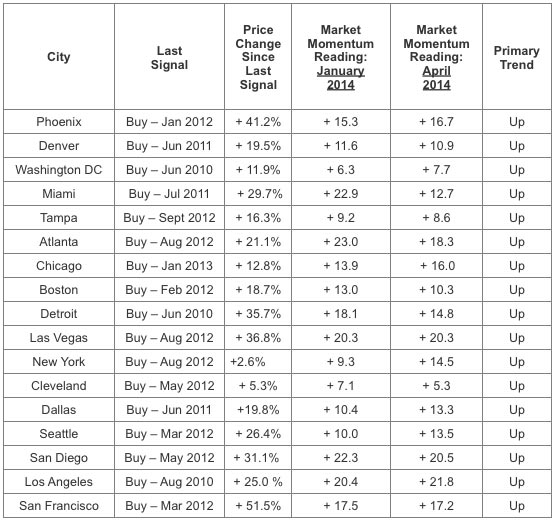
The Market Momentum (MM) readings for April 2014 show that 17 of the 17 cities were in primary uptrends – which include all three major California cities that I follow: San Diego, Los Angeles and San Francisco. There were also 17 cities in primary uptrends a year ago (April 2013).
The MM readings for 9 cities were more positive in April 2014 as compared to January 2014 – which is down from 11 cities in March 2014. This means that 8 out of 17 housing markets have weakened in the last two months. Of the 17 cities I track, Los Angeles is the strongest housing market in the U.S. – with an April 2014 MM reading of + 21.8.
For the 2nd month in a row, Cleveland is the weakest housing market I follow – with an April 2014 MM reading of 5.3. After being the weakest market from March 2013 to January 2014, Washington D.C. has now been the 2nd weakest market for the last 4 months.
If you look at the change in the MM readings for the last 4 months (Jan 2014 vs. April 2014), the 3 cities that became stronger at the fastest rates were Miami (+ 10.2), New York (+ 4.7), and Atlanta (+4.7). The 3 cities that became weaker at the fastest rates were Seattle (- 3.5), Chicago (- 2.1), and Dallas (- 1.9).
Let’s now take a look at the Southern California real estate market, and find out what the key data is telling us about where housing prices are likely to go.
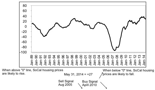
Real Estate Crash Index
The Real Estate Crash Index gave us a +27 reading as of May 31, 2014. The record high was +38 in December 2013. This forward looking indicator is telling us that Southern California housing prices are likely to rise for the next 3 to 6 months. As seen in the chart below, a “buy signal” was flashed when the “0” line was crossed to the upside in April 2010.
Currently, three Vital Sign indicators are in trends that are friendly to price appreciation (new home building permits, notice of defaults, and foreclosure sales), and two are in trends that are unfriendly to price appreciation (existing home sales and mortgage rates).
Vital Sign Readings
IMPORTANT NOTE: While my Vital Sign trend indicators are based solely on statistical data derived from the San Diego real estate market, the trend signals they send have historically worked with equally good accuracy for the Los Angeles, Orange County, and many other California real estate markets. Thus, please be aware that I often use the words “Southern California” and “California real estate markets” interchangeably.
Vital Sign #1: Existing Home Sales
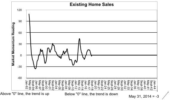
There were 3,405 Existing Homes Sales in May 2014, giving us a trend reading of -3. This is the 1st time since Jan 2012 that the Market Momentum reading has not been in positive territory. It has been statistically proven that Existing Home Sales are an excellent leading indicator for predicting the future direction of housing prices. The 12-month moving average (MA) was 3,165 in May 2014 – the lowest reading since Feb 2013.
Vital Sign #2: New Home Building Permits
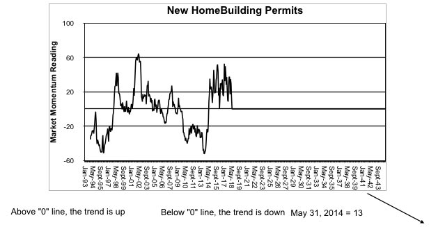
There were 329 New Home Building Permits pulled in May 2014. This produced a Market Momentum reading of +13. New home building permits are a good leading indicator as to what will be the future strength of the SoCal economy. The 12-month moving average (MA) was 671 in May 2014, the lowest reading since Nov 2013.
Vital Sign #3: Notice of Default
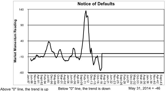
There were 427 Notice of Defaults in May 2014, producing a Market Momentum reading of -46. This tells us that mortgage defaults are in a downtrend, which is a positive sign for both the San Diego economy and its housing market. The 12-month moving average was 555 in May 2014 – the lowest reading since May 2006, and only four months prior to the peak of the price bubble for San Diego.
Vital Sign #4: Foreclosure Sales
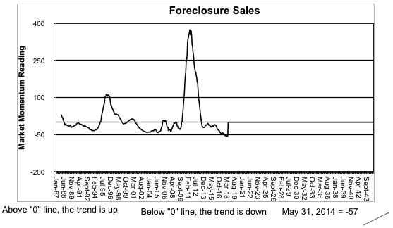
There were 150 Foreclosure Sales in May 2014, producing a Market Momentum reading of -57. This key indicator has now been in a downtrend for 58 straight months. The 12-month moving average was 203 in May 2014 – the lowest reading since Dec 2006.
Vital Sign #5: Interest Rates
According to the mortgage giant Freddie Mac, the average rate for 30-year fixed rate mortgages (FRM) declined to 4.12% in the first week of July – down from 4.29% in July 2013. After hitting a two-year high of 4.57% in Sept 2013, mortgage rates have fallen 0.40 percentage points in the last 10 months.
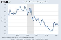
Mortgage rates have risen 0.9 percentage points since they hit a 50-year record low of 3.32% in December 2012.
In the eight weeks ending June 2013, mortgage rates climbed more than one percentage point in anticipation of the Fed tapering its QE3 stimulus program – which was created by the Fed to artificially suppress interest rates.
Even though the taper didn’t start until December 2013, mortgage rates have actually dropped since June 2013 – defying the predictions of investors and economists. And that folks, is just one more instance proving why facts speak 10 times more loudly than opinions.
Final Words
Success breeds complacency. Complacency breeds failure.
Only the paranoid survive.
– Andy Grove (Co-founder of Intel)
As hedge fund manager Howard Marks wrote in his book titled The Most Important Thing, “Rule number one: most things will prove to be cyclical. Rule number two: some of the greatest opportunities for gain and loss come when people forget rule number one.”
As a result of the Fed’s ultra-stimulative monetary policies, we may find out that the current upcycle in the housing market was built on fragile foundations. As an investor, don’t let greed get the best of you.
To all my valued readers, best wishes until next issue.
Robert M. Campbell
858-481-3235
New from Robert Campbell: “Where You Should Invest Your Money Now!” Because I believe the next 5-10 years will be a Battle for Investment Survival, let me show you how to intelligently navigate the difficult times I see ahead.
PS: With a 2-year subscription (now $265.00 due to inflation), you will receive for FREE one of my 4 investment strategies that I’ve developed and personally use for my own investment accounts. Each is valued at $145.00. Email me at Robert@RealEstateTiming.com for information on these strategies. One is titled “The Best Investment Strategy I’ve Seen in 30 Years!” – and it’s my #1 choice for avoiding risk and preserving wealth in a changing world.
PSS: Re-subscribe for 1 more year (now $135.00 due to inflation) and I will add one FREE issue to your subscription.
This entry was posted in Uncategorized · Tagged with Nick Myerhoff, housing market data, myerhoff and associates, real estate data, real estate east bay, real estate oakland, robert campbell